I recently got an e-mail from a reader worried by the fact that “a large number of buildings going up in Toronto these days are entirely black or dark grey.”
“What concerns me,” he wrote, “is that I don’t think anybody is considering the larger impact this could have. For example, will this eventually make Toronto a dark and gloomy place to live? Will it have a negative environmental impact, such as worsen the city heat effect?”
While I can’t speak to the climatic consequences of all that grey and silvery high-rise construction around town, the aesthetic results, 25 years into the condo boom, are obvious. The developers and their architects are giving us a city with a wintry, sombre look that seems to express what this northern metropolis thinks of itself.
That said, some creative people in the world are indeed “considering the larger impact” of outfitting cities with only grey, black and white towers – and coming up with pretty interesting alternatives.
One young architectural firm committed to injecting smart, effective colour into the city is Berlin-based Sauerbruch Hutton. A couple of years ago, Toronto got a chance to hear what this critically celebrated office was up to, when Matthias Sauerbruch, co-founder (with Louisa Hutton) of the 100-person company, spoke at a local design exposition.
I asked the architect why we don’t see more colour in the contemporary cityscape.
He replied: “In postmodern times” – roughly 1970 to 1990 – “there was a lot of colour in a Pop Art sort of way, garish sometimes. The use of colour was meant to be a shock, a departure from the good manners of modernism. Then, there was a reaction against that, in neo-modernism and minimalism, in polite white surfaces. Now colour is slowly, slowly coming back, as a way of tuning buildings, almost like you would tune an instrument – slightly shifting their appearance, their identity, their atmospheric quality. Like music, colour can be horrible, it can be noise. But it can also be a symphony.”
Since the designer’s Toronto appearance, his studio has produced a large and fascinating book, called Sauerbruch Hutton Colour in Architecture, that lays out several handsomely photographed European projects by the office, and argues convincingly for colour’s role in the enriching of big-city fabric.
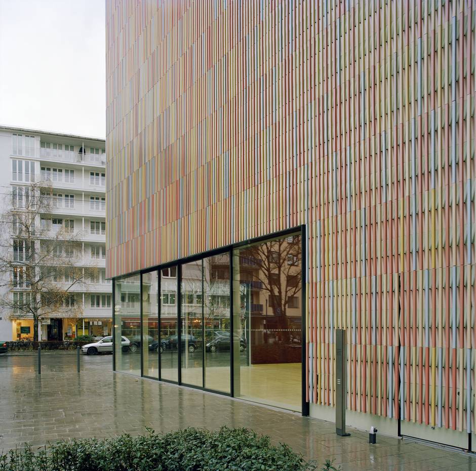
As we learn from this portfolio, the firm’s deployment of tints and hues in its buildings is subtle, and never in your face. The skin of the blockish Brandhorst Museum in Munich, for example, is composed of 36,000 vertical ceramic panels in 23 colours. It shimmers chromatically rather than facing the street with the plain white or brick front that have been favoured, until now, for showcases of modern and contemporary art. The building declares itself to be as up to date, and as inventive, as anything inside it.
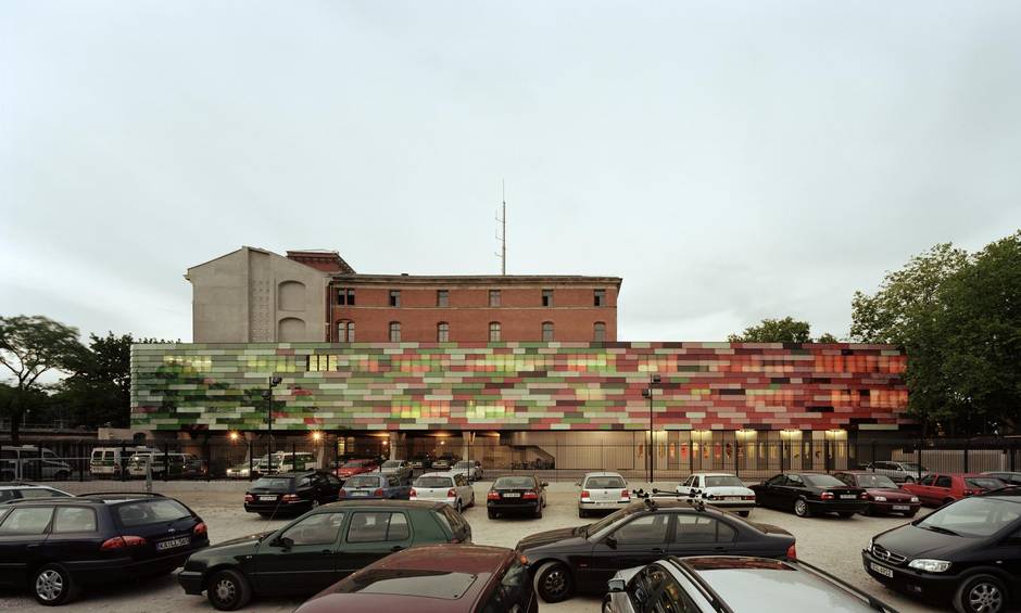
For a fire and police station in central Berlin that combines new construction with heritage preservation, Sauerbruch Hutton fashioned a lightweight, coloured-glass shell in two colour families. The red glazing is an homage to the ruddy brick of the antique structure the firm had to save, while the various greens correspond to the trees in the neighbourhood. The effect is very fresh, and lively without being merely novel.
The volume concludes with an “Incomplete Glossary for a future Manifesto on Colour in Architecture” by Mr. Sauerbruch and Ms. Hutton. Among these suggestive, resonant notes is to be found a working definition of the “chromaphobia” that can limit the imagination of architects.
This “impulse lurking within much Western culture” makes colour out to be ”the property of some foreign body – the oriental, the feminine, the infantile, the vulgar, or the pathological” or consigns it “to the realm of the superficial, the supplementary, the inessential, or the cosmetic.” In this formulation – familiar from the history of modernist architecture – the “bloodless stops on the scale from white to black” are favoured over any colour.
The research into how colour can be celebrated in architecture, it appears, has just begun. We can hope the movement takes root and flourishes. For its part, Sauerbruch Hutton and a few other contemporary designers are opening up avenues of aesthetic thought and discussion that might yet invigorate our cities of grey skyscrapers.